How to complement colours in your home interior

www.brightopaints.com
Some of the interior designs are genuinely a masterpiece of art. Are they real? You may question yourself thinking you can’t see anything better that day. Yes, they are real and yes, it is the right selection of colours that makes all the difference, by all means.
To go for the right colour palette while creating an interior for your room or the whole house is the most decisive aspect, as it largely affects the final look of your home. Fortunately there is a guide for colour selection and some of the core rules you can follow to end-up with perfectly matched colours in your home’s interior design. Here we will try to make your life easier with some useful tips and advices:
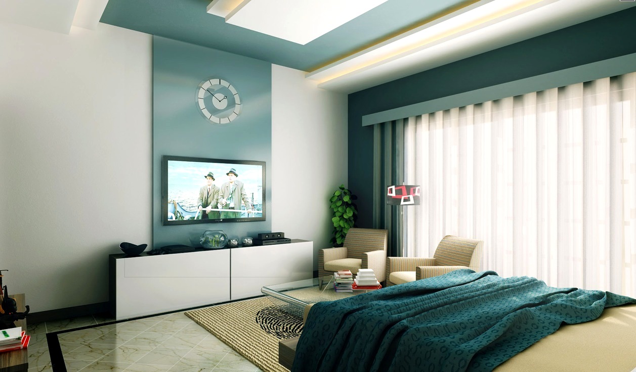
Rule of 60-30-10
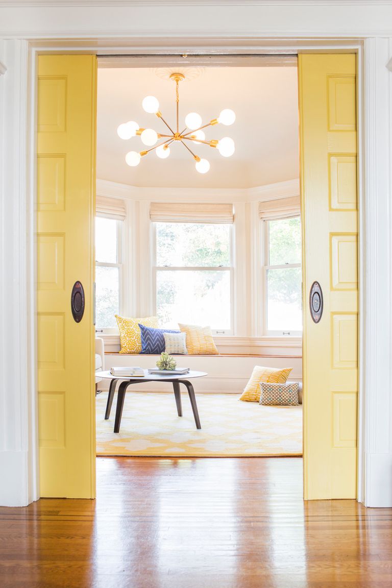
This simplest and let’s say the oldest rule of interior design, will help you silhouette the colour scheme for your home. 60% main colour, 30% secondary colour, 10% accent colour. As simple as that: the main colour (60%) is the one covering walls and floor in your room, can be also included in some of the pieces of furniture or draperies. The main colour is not necessarily neutral, but in many interior designs we meet white and off-white as it is very easy to blend in with the other colours and colourful details like furniture and decor.
The secondary colour represents 30% of decor as mentioned above. The secondary colour covers of your curtains, side chairs or the other elements of painted furniture. It is less saturated but different enough to easily contrast with the mainc colour and create additional interest in the whole interior.
And the last, but not least is the accent colour (10% of your decor). The main goal of the accent colour is to create a great contrast, it is frequently used as a pop-up and refers to pillows, artworks around the space or other decorative accessories.
Colour Wheel
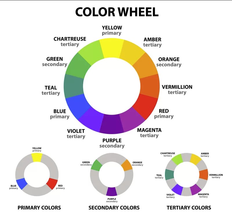
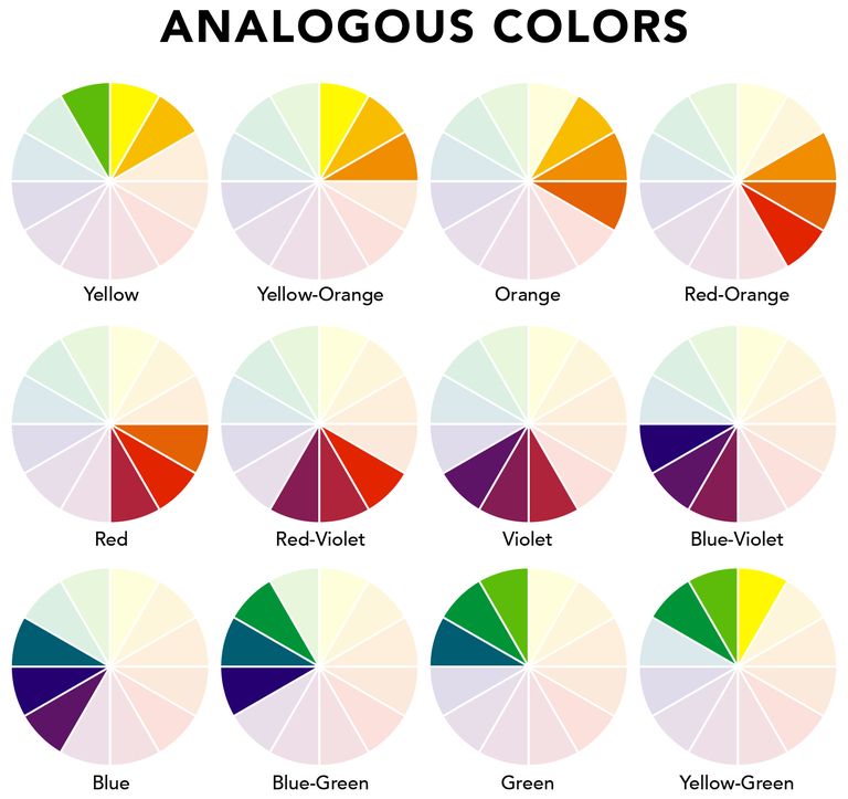
The other great method to go for, while choosing a colour palette for your home, is “Colour Wheel”. Colour wheel classifies colours by three different groups: primary, secondary and tertiary colours. When you are selecting a colour scheme for your home design, you can use this wheel in two different ways: 1) go for analogous colours, which typically contains primary secondary and tertiary colours but can be any three colours that are located side by side on the wheel (green-chartreuse-yellow or amber-orange-vermilion for example) or 2) select complementary colours, which are two different colours directly opposite on the wheel and they make each other more vivid when situated next to each other (yellow and purple for example). You can still apply 60-30-10 rule while using these methods, taking 60% of green, 30% of chartreuse and 10% of yellow if trying to use analogous colours or 60% of yellow and 30% of purple mixed with 10% of brown while going for complementary colours, e.g.
How colours affect you and your room
www.lumens.com
Once you decide to go for a colour wheel, it is a good idea to be clued in how colours affect the human mind and the spaces they are used for. Different hues and tones and shades also influence how you feel in the interior.
Cool colours tend to create a relaxed mood and calmness as well as natural colour tones achieve a cosy peaceful environment, while it is good to use warm colours in the dinette as they are inviting and joyful because of their vibrant character.
Colours can strongly affect the feeling of space. Light colours make the area feel more airy and spacious, whereas warm tones make a small space even smaller.
Taking light into consideration
www.elledecor.com
The amount and type of lighting has also a big influence on the appearance of the colour scheme. Daylight is a perfect source as it has a common intensity on the whole spectrum of the colours around. Natural light changes from sunrise to sunset so it is a good idea to make an observation on the room before you choose a colour scheme for it, to understand how much light enters the room and what period of the day. Rooms having the northern exposure get less daylight so it is a good idea to choose a warm colour palette for such space. Warm tones react well to artificial lights, which will be the main light source in that kind of room most probably.
Artificial lights also act differently in relation to colours. Incandescent lamps have a warmer emission than sunlight, while fluorescent lamps do the other way around - cooling down the environment by its blue lighting.
About the Author

Advantages of Scandinavian Design
July 29, 2022
Top Dining Table Trends 2023
January 5, 2023
Living room storage ideas
July 22, 2017
Worried About Assembly? Don’t be. We can do it for you.
July 11, 2016
Toronto New High Gloss Living Furniture Range
June 7, 2017
Storage space and shelving in child’s room
June 1, 2023
Advantages of bunk beds
May 16, 2023
How to choose furniture for your child’s room
May 12, 2023
Are teepee beds right choice for your child
May 10, 2023
Great benefits of wood furniture
May 9, 2023